A prospective remodeling client may compare project examples, process explanations and contact options before arranging a consultation. Make those details easy to find. This is an audience scenario, not evidence that a particular gallery count or financing form wins a contract.
A remodeling website should prepare a useful conversation about scope and fit. It cannot close every project by itself or assume a universal budget. Explain the actual process and show authorized work rather than diagnosing every lost opportunity as a design problem.
The good news: the sites that win these jobs are not more expensive or more clever. They are more deliberate. They remove doubt at every element, in a specific order. This is that playbook, built from what actually books six-figure remodels.
Test project navigation, mobile loading and inquiry routing on the actual site. Use documented project examples for scope and pricing. Broad web-design statistics do not forecast a remodeler’s conversion rate.
Why remodeling sites lose the job before the first call
A homeowner considering a whole-home remodel is not comparing your bathroom photos to your neighbor's bathroom photos. They are managing fear. Fear of overpaying, fear of a job that drags on for months, fear of a contractor who vanishes after the deposit. Every element on your site either lowers that fear or raises it. There is no neutral.
Most remodeler sites raise it without meaning to. Generic stock imagery signals that you have no real work to show. A gallery of eight blurry phone shots signals that your best work is not worth photographing. A missing process page signals chaos. A missing financing option signals that you only want customers who already have cash sitting in the bank. None of these are true about your business, but your site is saying them anyway.
A useful project gallery has relevant examples and enough context to understand the work. Pair it with current credentials, a clear process and an accessible contact route. There is no required gallery count or guaranteed one-minute financing approval.
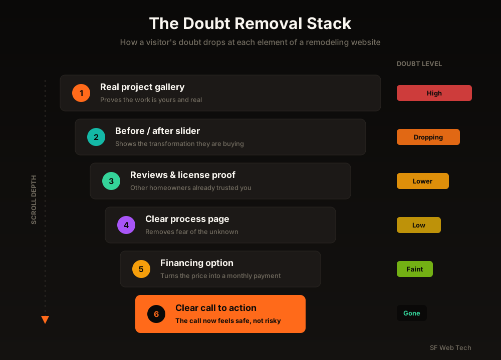
The Doubt Removal Stack: what a remodeling site must prove, in order
A high-ticket buyer moves through predictable questions as they scroll. Answer them in the wrong order, or skip one, and their doubt spikes back up. Answer them in sequence and the phone call becomes the natural next step instead of a leap of faith. Here is the stack, top to bottom.
1. Real project galleries do the selling, not you
Remodeling is a visual purchase. Homeowners are not buying a feature list; they are buying proof that you can deliver the kitchen in their head. That means your galleries are the single highest-leverage asset on the site, and most remodelers underinvest in them badly.
One 'Gallery' page with a wall of thumbnails is a filing cabinet, not a sales tool. What converts is individual project pages that tell a story the way a happy customer would tell it at a dinner party: this is what the family wanted, this is what we ran into, this is how we solved it, this is the result. Detailed project pages consistently outperform simple photo grids because they let a stranger imagine their own job going right.
2. Before and after is your most persuasive asset. Make it interactive.
Nothing sells a remodel like a dramatic before and after. It shows transformation, which is the exact thing the homeowner is buying, and it proves the work is yours because nobody stages a fake 'before.' A dated, cramped kitchen sliding into a bright open one does more selling than any headline you could write.
Put interactive before/after sliders directly on your service pages, not buried three clicks deep. When a visitor can drag the handle themselves, they engage with the transformation instead of glancing past it, and interactive sliders keep people on the page noticeably longer than static side-by-side photos. Longer on-page time on a remodeling site is not vanity; it is a buyer talking themselves into the call.
Galleries, before/after, and conversion built in from day one.
See how we design remodeling websites3. Trust proof belongs above the fold, not in the footer
Homeowners decide whether to trust a contractor in seconds (Stanford web credibility research on first impressions). If your reviews, real team photos, license and insurance details, and warranty sit in the footer, the majority of visitors never scroll far enough to see them. You are hiding your best evidence in the one place almost nobody looks.
Move the proof up. A row of five-star reviews near the top, a real photo of the actual crew (not a stock handshake), your license number, 'licensed and insured' stated plainly, and any warranty you offer. For a high-ticket remodel, the buyer is essentially interviewing you for a months-long relationship inside their home. Give them a reason to trust you before you ask them to scroll.
Use genuine customer feedback with permission, real team or project photos, current credentials and clearly scoped warranties. Do not selectively solicit positive reviews or display a credential the business has not earned.
“A homeowner about to spend more than they paid for their first car is not looking for the cheapest bid. They are looking for the safest choice. Your job is to be the site that feels safest.”
4. A clear process page kills the 'what am I signing up for' fear
The single biggest unspoken fear in a large remodel is the unknown. How long will my kitchen be unusable? When do I pay? Who shows up? What if we hit a surprise behind the wall? A process page answers all of it before the prospect has to ask, and almost no remodeler has one done well.
Lay out your job in clear steps: free consultation, design and selections, transparent quote, scheduling, build, walkthrough, warranty. When a homeowner can see the whole path from first call to finished room, the project stops feeling like a gamble and starts feeling like a plan. That shift is often what separates the contractor who gets the call from the three who get ignored.
5. Financing turns 'I can't afford that' into a booked job
If financing is genuinely available, explain who provides it and how it fits the estimate process. Keep cash price, financed cost and eligibility distinct. Do not assume every prospect needs credit or that a monthly payment makes a project affordable for everyone.
The strongest remodeling sites put financing in three places: near the pricing guidance under the hero, on every service page, and inside gallery captions where the buyer is already imagining their own project. A pre-qualification widget that gives a soft-credit answer in about a minute does two things at once: it removes the money objection and it hands you a warmer, more committed lead. Pre-qualified financing leads tend to close at meaningfully higher rates than cold inbound calls, because the buyer has already pictured paying for the work.
Use only current provider-approved financing language with the relevant terms near the claim. A monthly figure must not hide the financed amount, term or applicable conditions. Do not invent a payment illustration to make a project appear cheaper.
6. Make calling effortless, because most buyers still want to call
Provide both a clear call route and an appropriate form when the office can support them. Track customer preferences and qualification outcomes rather than assuming the largest projects always come through the phone.
Put a click-to-call phone number in the header on every single page, sticky on mobile so it follows the thumb. Keep the form as an option for people who prefer it, but never make the phone the hard path. And swap the generic 'Contact Us' button for a specific, valuable ask like 'Schedule a Free In-Home Design Consultation.' A specific, benefit-led call to action out-converts a vague one by a wide margin.
- 'Schedule a Free In-Home Design Consultation'
- Click-to-call number sticky in the header
- Phone offered before any form
- One clear next step per page
- 'Contact Us' with no benefit
- Phone number only in the footer
- A long form as the only option
- Five competing buttons, no clear priority
7. Two bonus fixes beyond the six: local proof and speed
Two more elements quietly decide a lot of close calls. The first is local proof. A homeowner in your metro wants to see a remodel you did three neighborhoods over, not a generic 'serving the region' line. Name the towns you work in, show projects in those areas, and pull reviews that mention real local streets and communities. Proximity feels like safety.
The second is speed. More than half of mobile visitors abandon a site that takes over three seconds to load (Google mobile speed research), and remodeling sites are often the worst offenders because they are stuffed with heavy, unoptimized project photos. Ironically, the galleries meant to win the job can sink it if they load like molasses. Compress images, use a fast host, and treat load time as a conversion feature, not a technical afterthought.
We build sites for home-service contractors who want the phone to ring.
Get a remodeling site built to convertTraffic without conversion is just an expensive bill
Here is the trap a lot of remodelers fall into. They pour money into Google Ads or SEO, get more clicks, and still do not book more jobs. So they blame the traffic. But the traffic is fine. The site is doing the leaking. Sending more visitors to a page that fails the doubt-removal test just means you pay more to lose the same jobs faster.
Fix the site first. Real galleries, interactive before/after, trust above the fold, a clear process, honest financing, and an effortless call. Then, when you turn up the traffic with ads or SEO, every extra visitor lands on a page built to close them instead of one built to lose them. That is the order that actually grows a remodeling business.
We will walk your site scroll by scroll and show you exactly where jobs leak.
Book a free website teardown callRelated reading
A great site still needs to be found. Here is what blocks the rankings.
Why your contractor website isn't rankingThe honest math on SEO for home-service businesses.
Is SEO worth it for contractors?Sources and further reading
- Google Search: SEO Starter Guide
Crawlable links, descriptive page information and content organization. Practical trade examples are SF Web Tech recommendations.
Source checked .
- Google Search: creating helpful content
People-first writing, useful original information and the absence of a preferred word count. Does not substantiate a client result.
Source checked .
- Google Maps: prohibited and restricted content
Rules against fake engagement, incentives and selectively soliciting positive reviews.
Source checked .